 SureShade.com optimized for desktop or mobile browsing with improved navigation, enhanced content features
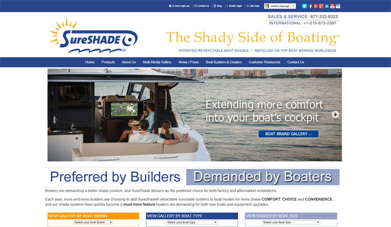
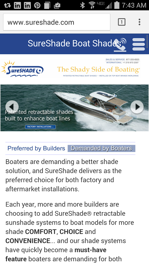
SureShade, the designer and manufacturer of patented telescoping sunshade systems, has a redesigned website that is responsive for an improved user browsing experience on any screen size or device.
The newly designed SureShade.com website now features quick navigation links to view shade options by boat brand, boat type or size, along with enhanced content for boat builders, dealers and private boat owners.
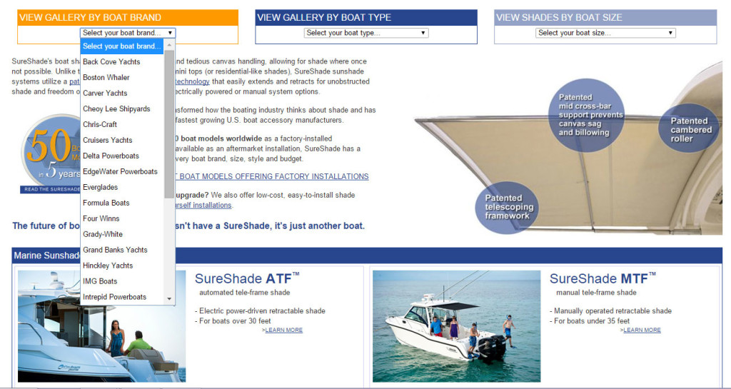
Visitors can simply select from a list of popular options – like boat brands or boat types – to be quickly directed to desired content in one drop-down selection.
Multi-media visual components, such as photo galleries by boat brand or type and video demos, have been increased throughout the website to accommodate new boat model installations and products launches.
In support of SureShade’s growing international builder and dealer demand for sunshade systems worldwide, the website can now be easily translated into one of 90 different languages with a simple drop-down selection.
The site uses Google Translation services to accomplish this easy translation without having to invest in fully translated versions of the website. International website traffic (outside of the U.S. and Canada) accounted for almost 21% of overall site traffic in 2014 for SureShade.
“SureShade has a very comprehensive installation portfolio that encompasses a wide array of boat brands and styles, and our website has always been a valuable tool to help the industry and boaters visualize how our shade systems can improve on a boat’s design and function,” said Diane Seltzer, marketing director at SureShade. “Our new responsive website design is just one way SureShade continues to evolve our marketing and branding efforts to support our unprecedented growth rate in the boating industry.”
Marine Marketing Best Practice
SureShade notes that in 2014 nearly 40% of their website traffic came from a mobile device – either a smartphone or tablet. The new responsive design will now provide a much improved browsing experience for these mobile visitors.
Updating a website to a responsive design eliminates the need to maintain a separate mobile website – keeping content more consistent across all device screens. Content dynamically shifts based on the device’s screen size, improving readability and navigation of content.
In addition to the ease of navigation, responsive website designs have a lot of SEO benefits. For one, Search Engine Journal notes that Google loves responsive design and will actually favor mobile optimized sites in search results. Their are also SEO benefits to having one (as opposed to a separate mobile URL) to keep all your “ranking juice” under one domain. Also, when the user experience is enhanced with ease of navigation the bounce rate is typically lower – helping to make a website more relevant in search results.
Marine businesses can get responsive websites in many different ways. Many website builders now offer responsive design built into their template choices – like Weebly or Wix – or you can have your website converted using tools like DudaOne (a responsive design tool). If your site is built on WordPress.org platform (like MarineMarketingTools.com) then there are countless responsive design themes to choose from for a website.
Editor’s note: the editor of this site is also the marketing director for SureShade.